Example
Frequency Polygon
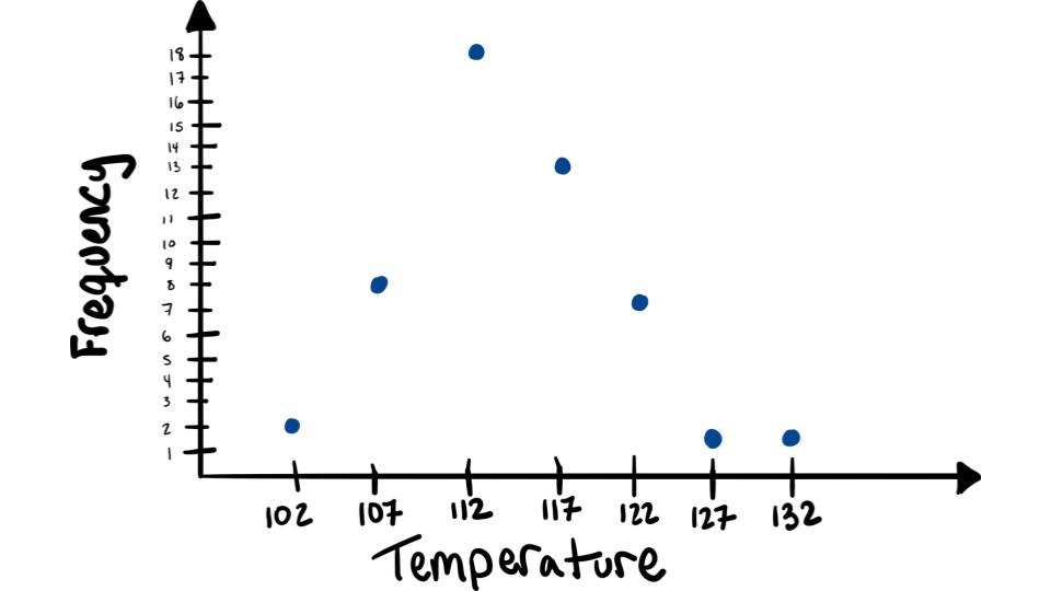
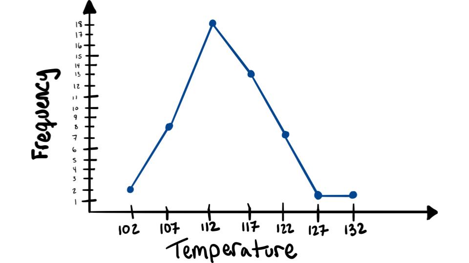
For this example we will use the hottest days data from the Now You Try! activity on frequency tables.
Step 1: Find the midpoints of each class. Recall that midpoints are found by adding the upper and lower boundaries and dividing by 2.
For example:
\[\dfrac{99.5+104.5}{2}=102\]
| Temperature Classes | Mid-Points | Frequencies |
| 99.5-104.5 | 102 | 2 |
| 104.5-109.5 | 107 | 8 |
| 109.5-114.5 | 112 | 18 |
| 114.5-119.5 | 117 | 13 |
| 119.5-124.5 | 122 | 7 |
| 124.5-129.5 | 127 | 1 |
| 129.5-134.5 | 132 | 1 |
Step 2: Draw the \(x\) and \(y\) axes. Label the \(x\) axis with the midpoint of each class, and then use a suitable scale on the \(y\) axis for the frequencies.

Step 3: Using the midpoints for the \(x\) values and the frequencies as the \(y\) values, plot the points.

Step 4: Connect adjacent points with line segments.

To see this worked out watch the following video: